TL;DR
Software engineer Nikita Prokopov highlighted that macOS Tahoe’s menu icons resemble a design approach Apple’s 1992 Macintosh Human Interface Guidelines explicitly discouraged. Prokopov argues the proliferation and inconsistency of icons in Tahoe reduce their usefulness and offers examples and suggestions for improvement.
What happened
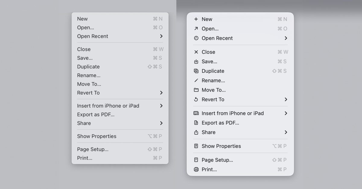
macOS Tahoe’s new app and in-menu icons drew criticism after last year, with readers offering mixed reactions in a 9to5Mac poll. Nikita Prokopov published a post comparing Tahoe’s menu icon strategy with Apple’s 1992 Macintosh Human Interface Guidelines, which recommended against placing icons next to every menu item. Prokopov shared the old guideline graphic showing an “ugly” menu dense with icons contrasted with a cleaner design that uses few in-menu icons, and said Tahoe effectively replicates the denser approach. He argues that icons are intended to speed recognition, but when every item has an icon nothing stands out, undermining their purpose. He also documented inconsistent iconography across Apple apps — multiple different icons used for the same action like “New,” and identical icons used for different actions such as a new note versus editing an address. His post includes many examples and proposes using fewer icons plus color-coding as fixes.
Why it matters
- Icons are a key part of interface discoverability; overuse can reduce their ability to guide users quickly.
- Inconsistent symbols for the same action increase cognitive load and can confuse people switching between apps.
- Design guidelines from platform makers shape developer expectations; perceived contraventions can weaken trust in those standards.
- Although display resolutions have improved since 1992, the argument that clarity alone justifies mass icon use is challenged by usability concerns raised by Prokopov.
Key facts
- macOS Tahoe’s app and menu icons faced public criticism and mixed reader responses in a 9to5Mac poll.
- Nikita Prokopov compared Tahoe’s menu icons to Apple’s 1992 Macintosh Human Interface Guidelines, which advised against many in-menu icons.
- The 1992 guidelines included a graphic contrasting an icon-dense “ugly” menu with a cleaner alternative that used few icons.
- Prokopov says adding icons to every menu item reduces their ability to help users find things faster.
- He cites Microsoft’s earlier practice of limiting icons to common functions as a preferable approach.
- Prokopov found that Apple uses inconsistent icons for the same function across different apps, including five different icons for a New action.
- He also identified cases where the same icon represents different functions, for example a new note in Notes and edit address in Contacts.
- His blog post contains numerous before-and-after examples and suggests improvements such as fewer icons and color coding.
What to watch next
- Whether Apple issues any response or clarification about icon choices in macOS Tahoe (not confirmed in the source).
- Design changes in future macOS updates addressing menu icon density or consistency (not confirmed in the source).
- Any official guidance or toolkit updates from Apple for third-party developers on icon usage after this critique (not confirmed in the source).
Quick glossary
- macOS: Apple’s operating system for Mac computers, providing the desktop interface and system features.
- icon: A small graphical symbol used in user interfaces to represent actions, objects, or functions.
- Menu icon: An icon displayed next to a menu item intended to help users quickly recognize the associated action.
- Macintosh Human Interface Guidelines (MHIG): A set of design recommendations and principles published by Apple to guide software interfaces on Macintosh systems.
Reader FAQ
Did Apple explicitly forbid icons in menus?
Apple’s 1992 Macintosh Human Interface Guidelines advised against placing icons next to every menu item; Prokopov compared Tahoe to that guidance.
Are the icon criticisms based on technical limitations like resolution?
The article notes resolutions have improved since 1992, but Prokopov argues that clearer rendering does not address the underlying usability issue.
Has Apple responded or announced changes to macOS Tahoe icons?
not confirmed in the source
Where can I see Prokopov’s examples and suggestions?
Prokopov’s blog post includes many illustrated examples and proposals such as using fewer icons and color coding.

I think Apple should take this radical approach to the new Siri Ben Lovejoy Jan 5 2026 MACOS MACOS TAHOE MACOS TAHOE 26 macOS Tahoe icons do exactly what Apple…
Sources
- macOS Tahoe icons do exactly what Apple said designers should never do
- Tahoe's Terrible Icons
- Tahoe's Terrible Icons | Page 7
- Tahoe's Terrible Icons, Another Take – TidBITS Talk
Related posts
- Samsung’s creaseless folding panel is likely the iPhone Fold display
- How to Feed Birds This Winter: Expert Tips to Attract More Species Safely
- New web tool aims to simplify Unix epoch conversions — is it the best?