TL;DR
A year after macOS Tahoe shipped with the Liquid Glass design, a long-time user finds the visual overhaul undermines legibility, consistency and accessibility. Subsequent updates 26.1 and 26.2 have not corrected several of the issues noted during beta testing.
What happened
macOS Tahoe, released on 15 September, introduced a sweeping visual update called Liquid Glass. The author reports multiple practical problems with the new look: window corners now have a very large radius that conflicts with rectangular content and can crop or shrink views; controls have been made larger but do not improve clarity, sometimes overlapping in third‑party demos; and app icons are constrained into a uniform rounded-square, reducing distinctiveness in the Dock. Transparency effects produce confusing bleed‑through in places such as System Settings and Finder, and a previously useful accessibility option — Reduce Transparency — no longer meaningfully reduces those effects after the 26.1 update on 3 November. The follow-up 26.2 release is described as leaving these regressions unaddressed. The author contrasts Tahoe with older macOS designs and says the changes have made content harder to read and interfaces harder to parse.
Why it matters
- Excessive corner rounding can misrepresent or obscure rectangular content such as images, video and webpages.
- Larger controls that do not improve legibility can reduce usable interface space and lead to overlap issues.
- Uniform icon shapes reduce visual cues that help users quickly identify apps in a crowded Dock.
- Increased transparency and washed‑out light mode reduce contrast and make it harder to distinguish controls and text, affecting usability.
- Accessibility controls that no longer work as expected can disadvantage users with visual impairments.
Key facts
- macOS Tahoe with Liquid Glass was released on 15 September (source states release date).
- Version 26.1 followed on 3 November and is said to have regressed in some areas.
- Version 26.2 has, according to the author, not addressed the reported issues.
- Window corner radii in Tahoe are substantially larger than in the previous Sequoia design, leading to cropping or reduced view size.
- Controls have been increased in width and can overlap in apps (demonstrated with a Mallyshag demo app example).
- SwiftUI windows in the same application can exhibit different corner radii (example noted in Providable on macOS 26.2).
- App icons are now confined to a uniform rounded-square, which reduces distinctiveness between icons (Developer app and App Store cited as similar).
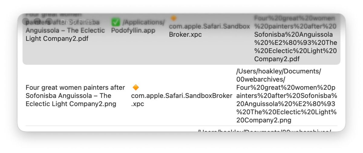
- Transparency in Liquid Glass can cause underlying content to bleed through UI elements, making controls and titles hard to read.
- The Reduce Transparency accessibility option no longer effectively reduces transparency after the 26.1 regression.
What to watch next
- Whether Apple will issue an update that restores clearer demarcation, fixes transparency regressions or revises corner radii — not confirmed in the source.
- If Apple will restore full functionality to the Reduce Transparency accessibility control in a future release — not confirmed in the source.
- Potential design tweaks to icon rules or control sizing in later macOS updates to address recognizability and layout problems — not confirmed in the source.
Quick glossary
- macOS Tahoe: A major macOS release referenced in this report that introduced the Liquid Glass visual design.
- Liquid Glass: The name given to Tahoe’s new visual language, characterized by increased transparency and rounded, glossy surfaces.
- SwiftUI: Apple’s user interface framework for building app interfaces across its platforms.
- Reduce Transparency: An accessibility setting intended to lessen or remove transparency effects to improve contrast and legibility.
- Dock: The area of the macOS desktop that holds app icons for quick access.
Reader FAQ
Did the author test Tahoe before release?
The author refers to three months of beta feedback prior to Tahoe’s public release.
Are the transparency and accessibility issues resolved in later updates?
According to the author, the 26.1 update regressed the Reduce Transparency control and 26.2 has not fixed it.
Do icon changes affect app recognition?
The author reports that enforcing a uniform rounded-square for icons reduces distinctive visual cues and makes some apps harder to tell apart.
Will Apple make further changes to address these complaints?
not confirmed in the source
hoakley December 28, 2025 Macs, Technology Last Year on My Mac: Look back in disbelief If someone had told me 12 months ago what was going to happen this past year,…
Sources
- Last Year on My Mac: Look Back in Disbelief
- 10+ macOS Tahoe Features You Might Have Missed | Page 2
- Last Week on My Mac: Tahoe 26.1 disappointments
- macOS Tahoe Review: 5 Features That Changed My Workflow
Related posts
- How I built MacThrottle — a macOS menu bar app to detect thermal throttling
- Apple-notarized macOS malware rising as attackers exploit notarization gap
- The Best PS5 Games of 2025 — Sony’s Standouts Despite Fewer Exclusives