TL;DR
Apple’s macOS Tahoe adds small icons to nearly every menu item in stock apps, prompting criticism that the change reduces usability. Designers in the source argue the icons are inconsistent, often reused for different commands, and too detailed for their tiny render size.
What happened
In a close read of Apple’s latest macOS release, Tahoe, the author documents a system-wide addition of icons next to menu items across built-in apps. Screenshots examined come from macOS 26.1 and 26.2 and were taken from preinstalled Apple applications with no settings altered. The critique centers on several interrelated problems: when every menu entry has an icon, the graphic no longer highlights or differentiates important commands; many common operations use visually different symbols across apps or even inside the same app; identical icons are sometimes applied to distinct actions; and minute visual differences are relied upon to convey different meanings. The icons are drawn at very small sizes (roughly a 12×12 logical-pixel footprint, 24×24 on Retina), which, coupled with vector-based rendering and lack of pixel alignment, makes many symbols hard to read. The author also highlights mismatched metaphors that can confuse users rather than clarify functionality.
Why it matters
- Icons are a navigational aid; when they fail to differentiate, users can take longer to find commands.
- Inconsistent symbols across apps break learned expectations and increase cognitive load.
- Tiny, detail-heavy icons can be illegible on current Mac hardware and worse for users with visual impairments.
- Reusing the same symbol for different actions undermines the shortcut benefits icons are meant to provide.
Key facts
- The critique focuses on macOS Tahoe and examples come from stock Apple apps.
- Screenshots cited were taken from macOS versions 26.1 and 26.2 with no system settings changed.
- Many menu icons occupy about a 12×12 pixel logical area (24×24 on Retina displays).
- Comparison in the source contrasts Tahoe icons with older 16×16 icons at 72 DPI, showing a much smaller physical render on modern high-DPI displays.
- Apple’s icons in Tahoe are produced as vector glyphs (SF Symbols style) rather than fixed bitmaps, which the author says hurts pixel alignment and crispness at tiny sizes.
- The author documents inconsistent representations of common commands like New, Open, Save, Close, Find/Search, Delete and Minimize across apps.
- Examples include cases where identical icons are used for different actions and where subtly different arrows or pencils are used to indicate different commands.
- The Photos app is singled out in the source as an example with a large number of visually similar or reused icons.
What to watch next
- Whether Apple issues design guidance or modifies Tahoe icons in a future update: not confirmed in the source.
- User and accessibility feedback following Tahoe’s release and any official responses from Apple: not confirmed in the source.
- Potential macOS updates that change icon rendering (bitmapped vs vector) or sizing decisions: not confirmed in the source.
Quick glossary
- Icon: A small graphic used in an interface to represent a command, object or action.
- Retina display: Apple’s term for high-density screens where pixels are packed tightly enough that individual pixels are difficult to distinguish at normal viewing distances.
- DPI (dots per inch): A measure of pixel density that affects the physical size of rendered graphics on a screen.
- Pixel grid / pixel alignment: Design practice of aligning artwork to the underlying pixel grid so edges and strokes render sharply at small sizes.
- SF Symbols: Apple’s system of vector-based glyphs used for UI icons and symbols across platforms (term appears in the source context).
Reader FAQ
Did the reviewer examine user-modified systems or third-party apps?
No — the screenshots come from stock Apple apps on macOS 26.1 and 26.2 with no system settings changed.
Are the tiny icon sizes and DPI numbers documented?
Yes. The source notes many icons occupy a roughly 12×12 logical-pixel area (24×24 on Retina) and compares that to historical 16×16 icons at 72 DPI, showing much smaller physical dimensions on modern high-DPI Mac displays.
Does the source claim Apple will fix the icons?
Not confirmed in the source.
Are accessibility impacts, such as for low-vision users, quantified?
Not confirmed in the source.
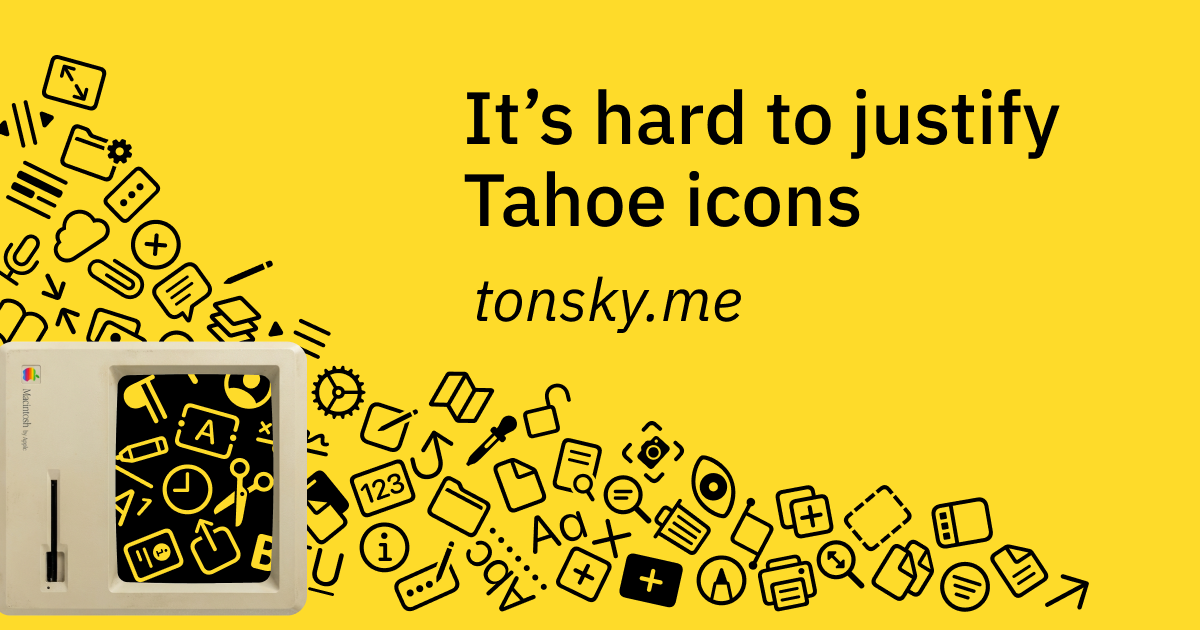
It’s hard to justify Tahoe icons I was reading Macintosh Human Interface Guidelines from 1992 and found this nice illustration: accompanied by explanation: Fast forward to 2025. Apple releases macOS…
Sources
- It's hard to justify Tahoe icons
- Blurry or pixelated icons on dock after u…
- macOS Tahoe's icons are a step backwards
- macOS Tahoe's Terrible Icons
Related posts
- Magnesium Supplements Crash Course (2026): Uses, Benefits, and Risks
- Shogun Creator Says Upcoming Season 2 Will ‘Defy Expectations’
- How the original Roomba’s behavior-based simplicity reshaped consumer robots